- Web Architecture Consultant
- Java Community Professional
- Father, Speaker, Beer Lover
-
What Keeps me busy
- Skiing, Mountain Biking
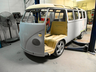
- The Bus
- AppFuse
- Raible Designs
-
Contact Information
- www: http://raibledesigns.com
- email: matt@raibledesigns.com
- twitter: @mraible


